Unlike common candlestick charts Heikin ashi candles try to filter out some noise of the market and display the prices in a form that is much easier to comprehend. Heikin ashi simplifies the trend identification and the process of chart trading.
HA Open = (HA Open -1 + HA Close -1) / 2
HA High = MAX of (High 0, HA Open 0, HA Close 0)
HA Low = MIN of (Low 0, HA Open 0, HA Close 0)
HA Close = (Open 0, High 0, Low 0, Close 0) / 4
- HA Open works with previous Open and Close prices (not the underlying asset prices, but the already calculated Heikin ashi prices).
- HA High is the maximum of the current High price and Heikin ashi Open and Heikin ashi Close.
- HA Low is the minimum of the current Low price and Heikin ashi Open and Heikin ashi Close.
- HA Close just makes an average of the Open, High, Low and Close prices.
This is where some other websites make mistake, e.g. Investopedia states miscalculation for HA Open. Sometimes we also get questions about the very first calculation of the Heikin ashi values. As the HA Open, HA High and HA Low require previous HA values for their calculation technical traders are quite confused how to calculate them at the beginning. Well, there are two possible ways how to solve this issue. The first one is to use the normal Open, High and Low prices of the underlying asset. The HA Close does not require previous value so you can calculate as stated in the formula before. After this adaptation, the next day (second day of the calculation) can be calculated completely according to the HA formulas. The second possible way is to let it be (especially if you use MS Excel). In such case Excel will use 0 values (for HA Low and HA Open) but the values will adapt themselves to more precise ones within a couple of days. Don’t worry – if you have a longer sample of data the most important days are the last ones (the days you make trades in) not the first ones.
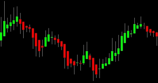
In the following text we would like to show difference between the classic Candlestick chart and the Heikin ashi candlestick chart. So first a common candlestick chart:

As you can see the red and green candles tend to take turns quite often and you would find max. 4 candles with the same color in a row. If you take a closer look you would find a nice price channel sloping downward in the first half of the graph. In the second part of the chart you can realize a trendline pointing upwards. These technical chart patterns would generate nice signals (especially after breaking the first price channel) despite the single candles are quite messy with many whipsaws. Now take a look at the Heikin ashi candles below:
The chart is much more clear now. You can find even 14 green candles in a row so the trends are more visible. Just take a look at the first 6 candles in classic Candlestick chart and then in Heikin ashi candlestick chart.
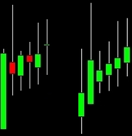
As you can notice there are 2 red candles in classic chart that turned into green ones in the HA chart. That is because of the Heikin ashi calculation. To simplify the explanation: Heikin ashi works the same way as classic Candlestick chart does. If the Close price is higher than Open price the candle is green. The opposite is true for Close price closing below Open price (we get red candle). So how is it possible that the HA chart was able to eliminate the red candles? Heikin ashi calculates the HA Open as an average of previous HA Open and HA Close (that means Heikin Ashi new candle always opens in the middle of the previous one - and that is the reason why it looks so smooth and nice). It also calculates the HA Close as an average of the current Open, High, Low, Close of the underlying asset prices. So that the candle was green it would simply require today’s OHLC prices to be a little bit higher than yesterday’s OC prices of Heikin ashi. Despite the explanation is simplified we believe you captured the main idea. In other words – it would need some pressure of the OHLC prices to recolor the next candle in contrast with the prior trend.
Theory that lies behind Heikin ashi trading says that you should follow the shadows (tails) of the single candles. Compare the shadows pointing up and down and focus on the longer one. If the longer tail points down it means the downtrend prevails on the market and you should go short (selling pressure on the market). If the longer tail points up it means the uptrend prevails on the market and you should go long (buying pressure on the market). Candles with strong shadows on both sides use to indicate an upcoming trend reversion. You can also notice that when the HA candles turn into weaker (shorter bodies) we can expect trend reversion. It is a good idea to prepare for it (a trader can at least to tighten his Stop loss orders).
Probably the best trading techniques are based on searching for basic chart patterns like price channels and trendlines, supports and resistances etc. Thanks to the Heikin ashi candles the chart patterns are much more visible in the graph.